
In the Water, Toward the Woods, Woodcut

This is a two color woodblock print made with oil based inks. Woodblock prints are "relief prints," in that the nonprintable areas are carved away, leaving a low relief of the image left level with the original uncarved surface. 
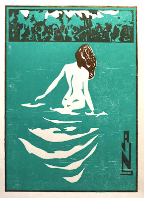
The inspiration for this image is Ichijo Narumi's postcard print designed in 1906. Narumi's print is a lithograph, not a woodcut. But the simplicity of the design and imaginative use of the limited palette is a model for any printmaker doing their first two color print. 
Two color prints are made using two printing plates. I carved both into one block of pine, each registered at the top and right sides so that I could simply slip the paper into the pre-carved grooves and know that the second printing would line up with the first. The green block is printed first, the brown second. Because the brown ink is transparent, where it overlaps the green ink, it produces the darker color of the forest and signature, making this technically a 3 color print. 

I proofed the the block in different forms to gauge its appearance, leaving me with distinct "Artist Proofs." These allow the printer to see what work is left to be done. In this case I still needed to carve lines into the hair. 

I produced 9 roughly identical prints using these colors. Future editions will use alternate colors. These first 9 are $29.50 a piece. Please message me to purchase. Or consider becoming a "Print Subscriber" through my Patreon page and receive a new print every month sent to your door. Patreon Page

Comments

Popular posts from this blog

Giuseppe Arcimboldo and the Double Image

Giuseppe Arcimboldo (1526 – 1593) was an Italian Renaissance painter famous for his imaginative and unconventional portraits. Born in Milan, he served as a court painter for the Habsburg emperors in Vienna and Prague. Arcimboldo's unique style is characterized by his "composite portraits" which used a combination of objects, fruits, vegetables, and other elements, arranged to portray a human face. These whimsical and highly detailed works are often interpreted as allegorical representations of the seasons, elements, or human attributes. The Four Seasons  1563-73 Arcimboldo's most famous series of paintings is "The Four Seasons"  where he cleverly arranged items like flowers, fruits and branches to capture his enigmatic visages. Today, Arcimboldo is popularly known primarily for his influence on the surrealists. But Arcimboldo's influences is more far-reaching than that. From the chalk cliffs of Germany to the American Southwest, Arcimboldo has helped sha...

How to Paint a Landscape in Oil

This is a landscape painted with oil on paper. It was painted from a photograph and the subject is a pond in Central Park. The visual theme is "distance" and all of my choices were made in order to communicate and stress the illusion of space.  The painting was made in four layers, with a few days between each one to allow the paint to dry. I am going to describe the process of each layer. STEP 1 The first step is to block in the large shapes. This is a means of mapping out the composition, choosing which objects will be included and which omitted. The exact tones used at this stage are not absolutely critical but are an approximation of the target colors. Since they will serve as a substrate for subsequent layers, I mixed them lighter and duller than my target colors. That way they won't dominate subsequent layers by showing through and altering the color of those layers—at least no more than I want them to. STEP 2 The next layer of paint is ...

Drawing a Male Nude

I began this project with a sketch from a live model. This was done quickly and roughly, as a mere practice exercise. My goal was basically naturalistic—to record the body of the model in the pose that he had chosen. However, I emphasized certain elements that I found striking. The angularity of the shadows produced by multiple lights sources; the separation of the muscles into rotund masses; the elongation of the limbs; these were all spontaneous stylizations suggested by the model's body. These were what made me want to develop the sketch further The first step was to identify what I liked about the drawing and the pose, and to distinguish these from what was accidental and irrelevant.  I did this by laying tracing paper over the original sketch and manipulating various aspects of the figure to see which elements were essential and which could be changed. I found that I liked the twist of the body and that this could be emphasized by adjustments of the ...